Opinion: The new iPhone SE is a smartphone solution in search of a problem
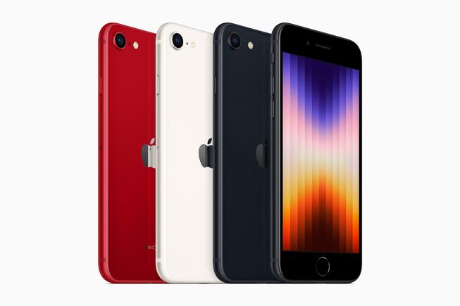
As of today, Apple has a new budget option aimed squarely at iOS users holding on to older devices. The new iPhone SE is currently the cheapest avenue into the iPhone world, but I think it’s a completely unnecessary product that’s desperately trying to justify its existence.

I want to start on a positive note. The main draw for the iPhone SE has long been its price tag. Ever since the first iPhone SE launched in 2016, it’s been a solid option for people that wanted a smooth smartphone experience at a low price. Its use of older Apple designs was often seen as a plus (particularly for the 2016 SE); the smaller form factor was welcomed in a world of ever-increasing smartphone slabs. The iPhone SE 3 still hits these high notes and is a unique option.
The older iPhone 8 body style was excusable in 2020. Apple was still refining “The Notch,” and the 2020 SE gave people the newest silicon in one of the better body styles. It was a good option for people that didn’t like Face ID (or preferred Touch ID) and hated The Notch.
But times have changed. The Notch is now a fact of life in the iOS landscape. Love it or hate it (I don’t know of anyone that loves it), The Notch has defined not only the aesthetic of the iPhone but of iOS. Many apps are built around The Notch, and Face ID has come a long way since its introduction in the iPhone X. Both Face ID and The Notch are now integral parts of the iOS experience (for better or worse), and the iPhone SE 3 omits both.
For the record, I prefer Touch ID and love it on my iPad Air 2020. It’s also one of the reasons I still use an iPhone 8. But it feels outdated, and I’ve noticed some strange quirks in the layout of certain apps, almost as if they’re expecting The Notch to be present. However, these aren’t dealbreakers, and my main beef with the iPhone SE 2022 isn’t its design (although those bezels are gaudy relics that have far overstayed their welcome).
}})