What’s the latest in phones and tablets? Apple and Samsung update their product lines.
What’s new in smartphones and tablets? If you are in the market for one or both of these devices, I’ve got the latest from Samsung and Apple.
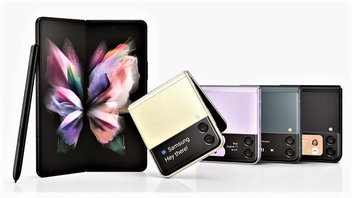
The Galaxy Z Fold3 from Samsung is an Android phone that unfolds to become a tablet. Yes, you read that right. There’s also the Galaxy Z Flip3, an Android phone that folds in half so it’s much easier to slip into a pocket or purse.
Are either of these wacky phones for you? Read on.
Apple, meanwhile, has unleashed its usual early-autumn flood of iPhone and iPad news. One intriguing development is the latest iPad mini, which has been entirely redesigned; I bought one and have impressions.
New iPhone 13 models are incremental upgrades, but have much better battery life along with improvements on the photography front.
Fold it, flip it
There’s a joke in the tech world that goes something like this: Any phone can fold, but you want one that can fold more than once.
Samsung wasn’t laughing in recent years when it released folding phones that were beset with problems. An early Fold model tended to break down almost immediately.
Now, on its third pass, Samsung has released folding phones that appear to hold up better (though their longtime durability is difficult to gauge).
As a longtime tablet aficionado, I am most interested in the Galaxy Z Fold3. (AT&T sent me one to review.) This is a marvel of engineering with irksome compromises. Also, there is the cost: It starts at $1,799. That price tag might make sense if the Fold3 were a near-perfect phone and a near-perfect tablet, but it’s neither.
When closed, the Fold3 is a chunky rectangle, sort of like an oversized candy bar, with a screen on the front that is gorgeous but weirdly narrow and awkward to use compared to that of a regular smartphone. It works fine but won’t display all apps and websites properly, and might make you feel a bit claustrophobic.
When it is unfolded, the Fold3 is a great-looking tablet — well, a mini-tablet. This means you have more space to read, to write, and to watch videos. If a traditional phone screen feels cramped to you, this might be to your liking.
But you will run into annoyances. One of these is a seam running down the middle of the screen, where it folds. It’s invisible when holding the phone at certain angles, but painfully obvious at times. You might get used to it, and you might not (it didn’t bother me too much).
The bigger problem, for me, is software. Apps that look superb on a rectangular phone display don’t always look that great on a more-square tablet screen. Apple has solved this problem by getting developers to create different-looking iPhone and iPad apps, but this trend isn’t as far along in the Android world.
Samsung has been helpful by building screen-management tools into the Android operating system. You can arrange two or three apps on the Fold3 screen at once, alter how individual apps look on the display, and more. This is great, but a work in progress (as Samsung acknowledges by labeling some features as experimental).
So who is this phone for? If you have an ample budget, a taste for adventure, and a high risk tolerance, maybe it’s your jam. Average consumers will want to steer clear — but watch this space as folding phones continue evolving, and dropping in price.
For now, the Galaxy Z Flip3 makes more sense. (AT&T sent me one to review.) It looks pretty much like a regular phone when open; it’s about an inch taller than a standard Apple iPhone, which is great for adding another row of icons.

When flipped shut (a bit like a “Star Trek” communicator), it is a tidy bundle with a mini-display on the outside to displays the time, date, charge status, new messages, and more. The mini-screen also is used as a selfie-cam viewfinder. Samsung has offered super cute accessories, including a case that turns the Flip3 into an oversized keychain fob.
The best news here is the Flip3 price, starting at about $1,000, which is in line with traditional smartphones. You still have to contend with a pesky screen seam and uncertainty about how long the folding mechanism might last — but I see lots more folks buying this phone.
All-new iPad mini
Apple often takes its time redesigning its iPad tablets. The iPad mini, for instance, hadn’t seen an update since 2019, and didn’t look all that different before that, all the way back to the product’s 2012 debut.
So Apple isn’t hyperbolizing when it says the latest iPad mini is its biggest update ever. I was so enthused that I ordered one within an hour of its Sept. 14 unveiling.
The iPad mini embraces the design language of the larger iPad Air and fancy iPad Pro models. The classic Home button is gone, the edges are flatter, and the display is a bit bigger at 8.3 inches measured diagonally even though the overall package is about the same.
The iPad mini uses a USB-C port instead of a Lightning port, its A15 Bionic processor is similar to that in the new iPhone 13 models, and it’s compatible with Apple’s second-generation Pencil stylus that magnetically clips onto the right edge so you have a doodling and handwriting accessory handy. Its selfie camera has a new Center Stage feature that keeps you in the frame when you’re on a video chat even if you shift around.
This is the iPad for you if you want an Apple mobile device that’s bigger than an iPhone, for entertainment and light productivity, yet is more portable than the larger iPad models. Apple doesn’t make a clip-on keyboard for the mini as it does for the larger ones, but any Bluetooth keyboard will work.
I’m not sure I’ll keep my mini. Using it nonstop, I’m having some misgivings about how the small screen is impeding my ability to get work done, and I am looking to get a larger iPad.
The iPad mini isn’t super cheap at a starting price of $499 with a somewhat paltry 64 gigabytes of storage. The price tag does seem reasonable compared to that of the Galaxy Z Fold3, and the iPad has a bigger screen, tablet-friendlier apps, and fewer worries about hardware longevity.
If you are on a budget, check out the also-recently-updated entry-level iPad, at a starting price of $329. It looks much the same, a classic iPad with a Home button, and has only 64 gigabytes of storage in its entry-level configuration, but Center Stage and a zippier processor are on board, along with display refinements. I might spring for one of these.
iPhone for photos
Apple releases new iPhone models every year, and some such upgrade cycles are more amazing than others. This year is more evolutionary than revolutionary, but not without eye-opening aspects. The battery life is much improved compared to the iPhone 12 line, for one thing.
Apple always lavishes attention on its iPhone cameras and photography capabilities, and this year is no exception with improved lenses and enhanced software. The lower-cost iPhone 13 and iPhone 13 mini (with two rear-facing lenses, standard and wide-angle) benefit from this, and the higher-end iPhone 13 Pro and iPhone 13 Pro Max (with three lenses: standard, wide-angle and telephoto) even more so.
New features (that I will have a blast trying out in the coming weeks with all four of the iPhone 13 models Apple sent me) include:
Cinematic mode. You know those movie scenes where focus adjusts from the object or person in the foreground to something or someone in the background? The iPhone 13 phones do that! You can trigger and adjust the effect while shooting video, or while manipulating the files later (but only in Apple video-editing apps at first). Cinematic mode is a software feature that works on all iPhone 13 models.
Macro shooting. A few years ago, I attached a third-party macro lens to an iPhone so I could shoot closeups of monarch butterflies fluttering around my front lawn. The monarchs looked nice but the lens only offered middling image quality. Now Apple has brought macro shooting to the iPhone, and it looks much better. Only iPhone 13 Pro users get it, though, since its a lens-hardware feature.
Photographic profiles. Before shooting photos, you can lock in different modes or “profiles” that give the photos varying looks or personalities, such as “vibrant,” “warm” and “cool.” Once engaged, such a profile is the standard way the camera will shoot; think of this as the digital equivalent of film. You can even cook up your own profiles. This is a software feature that works on all iPhone 13 models.
I’ve not had a lot of time with the iPhones, so watch this space for new pictures that I’ll also post on my Instagram and Facebook feeds.
View this post on InstagramA post shared by Julio Ojeda-Zapata (@ojezap)
View this post on InstagramA post shared by Julio Ojeda-Zapata (@ojezap)
View this post on InstagramA post shared by Julio Ojeda-Zapata (@ojezap)
}})